

By Gina Graham, creativeinteriorsbg.com
Tuesday, September 17th, 2013 8:00 AM CST
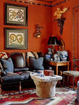
Warm colors such as reds, yellows and oranges inspire activity and are like wise designated for more active spaces, typically. Warm tones visually move towards you in a space. When used on large surface areas such as walls, floors, or even ceilings it can have the affect of bringing a space in. In a larger room this could naturally make a space more cozy and intimate. Conversely, in an already small space, it can make a room feel more cramped. More vibrant hues of these warm colors can have varying affects on us as well. Red is the most powerful color of the color wheel ,and therefore, is a good example. Red is often described as the color of fire and passion. When used in an intense or bright hue it ” has been shown to increase heart rate and blood pressure” (aokiinteriors.com) Reds have also been shown to stimulate the appetite and conversation. It is important to consider how you want to use such a powerful color as it can also make you feel that the perceived temperature of the space is elevated. More muted earthy shades such as a red ocher may make you feel quite cozy. More earthy hues can give you all the warmth, comfort and energy but with none of the exaggerated pulse”(aokiinteriors.com).
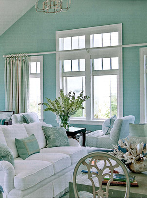
Conversely, your blue, purple, and green hues embody your cool tones. These hues are better reserved for “passive” spaces. Blues and greens are noted for being calm and restful. The two colors most representative of nature and most indicative of balance and harmony. As mentioned, reds have been known to stimulate appetite. When observing nature, you’ll find many natural occurring red foods; unlike, the color blue, where there are little to none naturally blue foods (even blueberries are a deep purple) Consequently, painting your dining room or kitchen blue may help to suppress your appetite!
Robert Allen Design Studio
There are many theories that can be applied when considering colors. Pick flavors that inspire you and make you feel the best in the room that your outfitting!
Take the time and fan them on facebook and don’t forget to Follow them on Twitter @CreateIntBG or youtube.